Culled from mbariuno.com
Designing the bottle of Mothercare‘s feeding range in 2011, Daniel Weil deviated from the advances of technology and engineering and found his muse in people and symbolism. He said; ‘to design a bottle, I needed to understand the development of parenting…”. Similarly, Hero Lager as a brand is a romantic- a birth child of historical symbolism. It is proudly allied, bold in speech and in sentiment, fluent in the language of the people it favors.
Brewed in the Southeastern city of Onitsha, the story of this proud alignment began in 2012 and even before then. In the wake of the burial of Odumegwu Ojukwu, the leader of the Republic of Biafra in 2011, a burgeoning brewery, 20 miles from his hometown was invested in by SAB Miller PLC. Upon opening in 2012, the flagship product of this brewery was named ‘Hero’. A subtle homage to Ojukwu perhaps, but this allusion to the regional hero was further emboldened by the logo of Hero lager; a rising sun, adorned with the significant tricolor of red, black, and green which were the colors of the Biafran flag. Perhaps the greatest indicator of its acceptance was the name it was christened on the streets- Ompa!, meaning ‘my father’.
Hero Lager is inspired by the Igbos of Eastern Nigeria, it is driven by their values, their stories, and their history. The brand’s ideal for the years that followed knighted it with the symbolic red cap and titled it “Mmanya ejiri mara Igbo’’- the Lager by which Igbos are known.
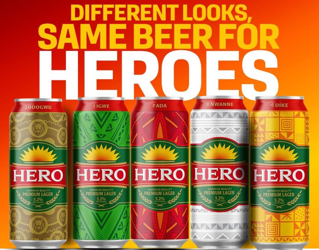
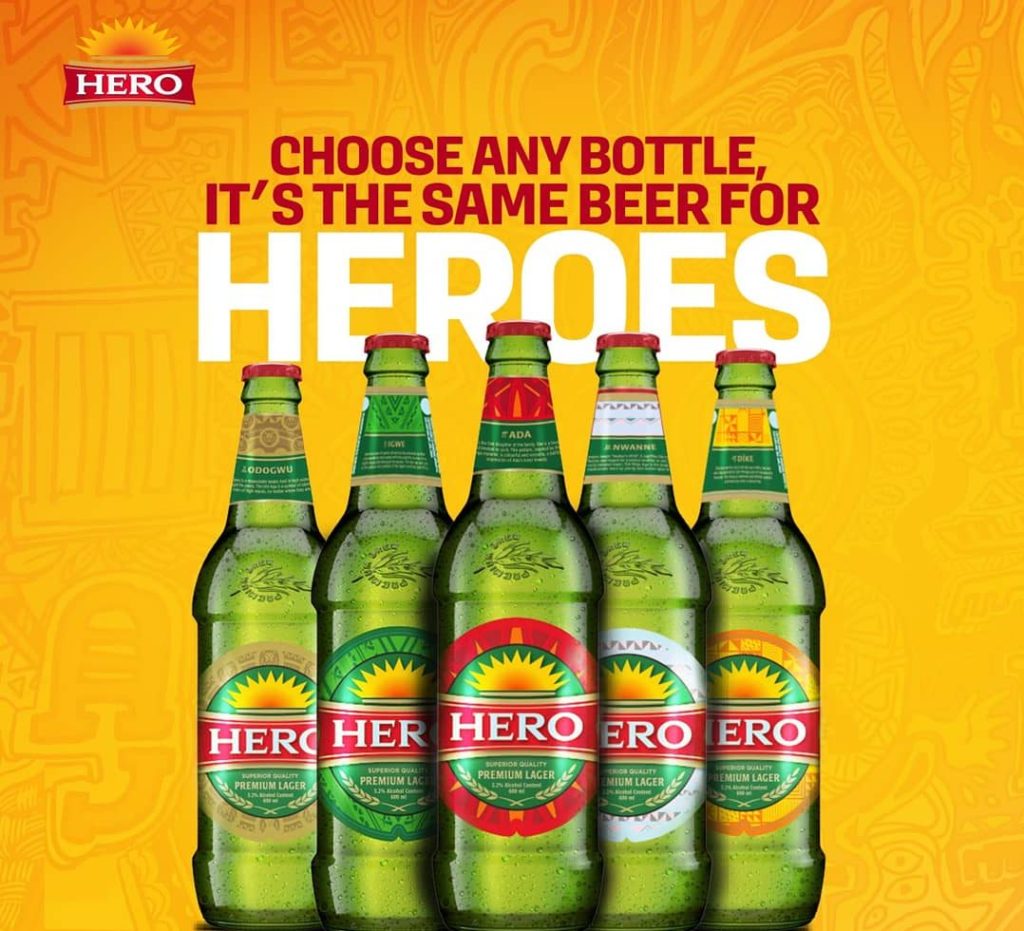
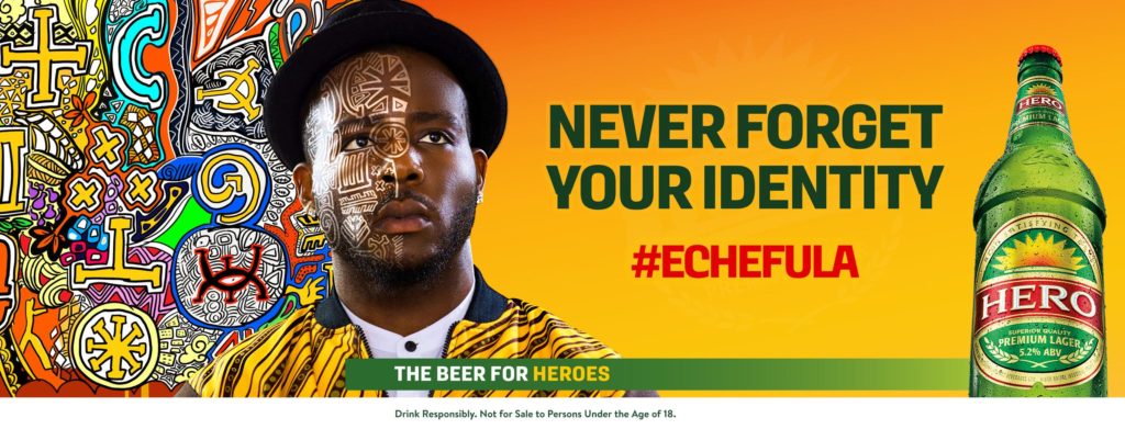
The introduction of the new limited edition can and bottle designs in March 2020 is not a surprising development. Following the 7even Interactive’s Echefula Campaign, under the creative direction of Ndukwe Onuoha; a notable Nigerian spoken word artist and ad man, a sort of vocal admittance of what the brand has idealistically represented for years, the urge to fuse this ideal with aesthetics was somewhat expected and birthed. Hero lager looks to wear a skin that is in tangent with what it represents.
The new Can design introduces Igwe, Odogwu, Dike, Nwanne, and Ada; clans representing the brand’s idea of a hero. The patterns representing each clan are inspired by metonymical symbols and signs wrought from traditional Igbo art and culture. Igwe; The King, is represented by a unique arrangement of resplendent patterns inspired by murals that are popular in the palaces of Eastern royal houses. Odogwu; The General is ideally represented by detailed illustrations of the lion, and its color is that of the animal skins worn by ancient Igbo warriors. Dike is the Hero, the Brave, the warrior. His signature is geometrical patterns carefully arranged and adorned with old astronomical details. Nwanne is the Brother, the Friend, son of the soil, the life of the party. Distinct in its plain color, Nnwanne patterns are simple, approachable and universal in its shapes. Easily, one of the most attractive, Ada’s symbol is a nuanced pattern that is pleasantly representative of beauty. It is inspired by the headgear of traditional royal Igbo women. It is a synergy of love, strength, and compassion.
Hero larger’s new cape is a marvel to behold. It is attractive and strong in its message. It further solidifies its brand position and reassures its patrons of their undying devotion. However, many might expect more from an alcohol brand that won gold at Monde Selection. Hero Lager is comfortably positioned but the disruption that often enhances global recognition is still missing in its identity. ‘Echefula’ is the Hero’s war chant. It represents the need to ‘never forget’ perhaps one’s heritage, one’s mission, one’s story; something akin to the Texans in the United States and their proud memorials of The Alamo.
However, the narrative should boldly weave its way into our present consciousness, rather than merely telling the Southeastern story to the Southeastern people, Hero Lager should consider telling it to those who are yet to hear it. There is no better time than NOW.